
DURATION: ONE WEEK
Octogram: Visual Identity Guidelines
ROLE: BRAND DESIGNER
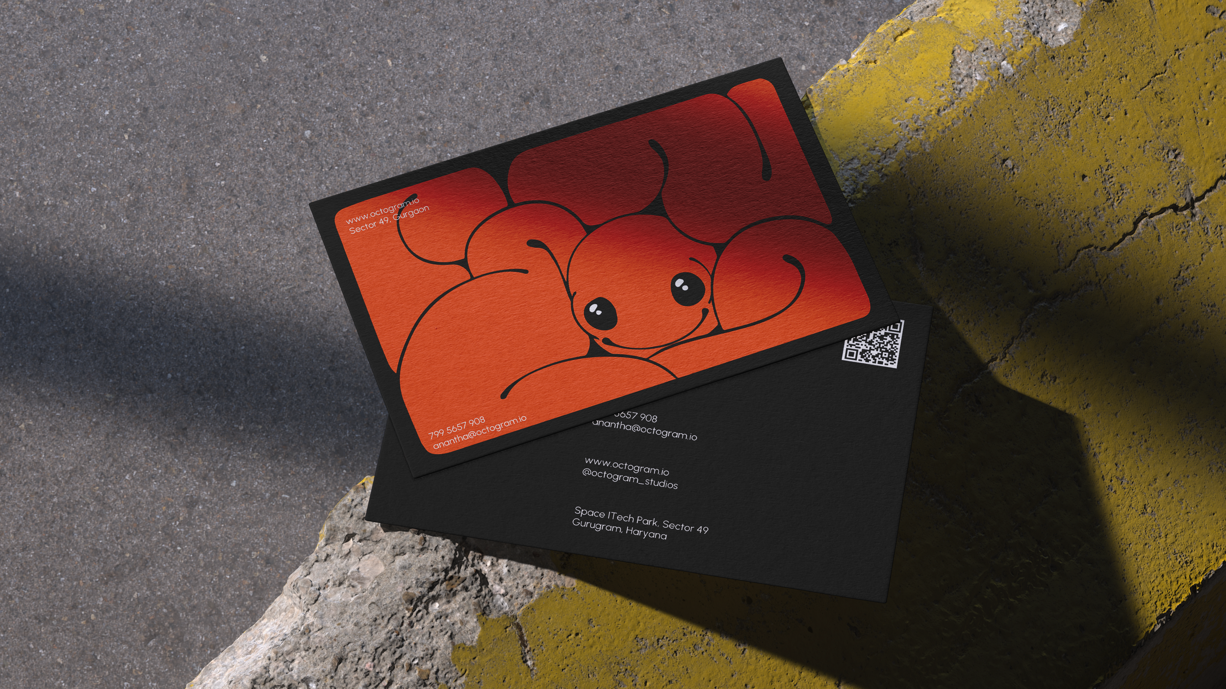
Octogram’s design agency had a logomark but no cohesive identity—colors were arbitrary, typography was a free-for-all, and internal teams were Frankensteining assets together with no consistency. Without clear rules, every presentation, social post, and client deliverable looked like it came from a different company. My challenge: in just seven days, reverse-engineer their accidental brand language into a bulletproof system that could halt the chaos and give their team instant clarity.

The Rescue Plan.
I attacked the week like a design SWAT team: Days 1-2 were spent forensic-analyzing their best existing work to extract unintentional patterns, then codifying them into a vibrant (but disciplined) color system and a sharp type duo. Days 3-4 focused on creating foolproof templates and hard rules (“Never squash the logomark’s negative space”). By days 5-7, I was packaging it all into a modular PDF guideline and running a crash-course workshop—turning confusion into confidence before the week’s end. The result? A unified visual voice that stuck, because it was built from their real work, not imposed on it.

